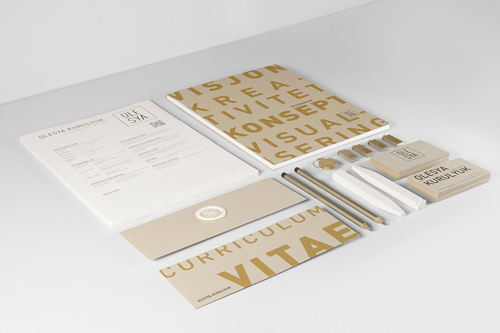
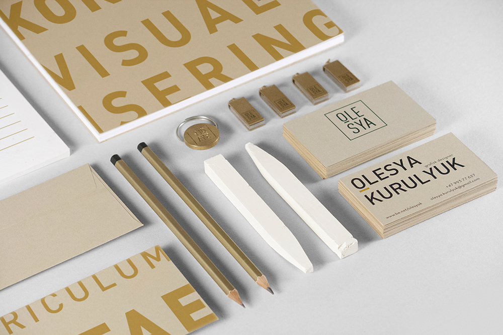
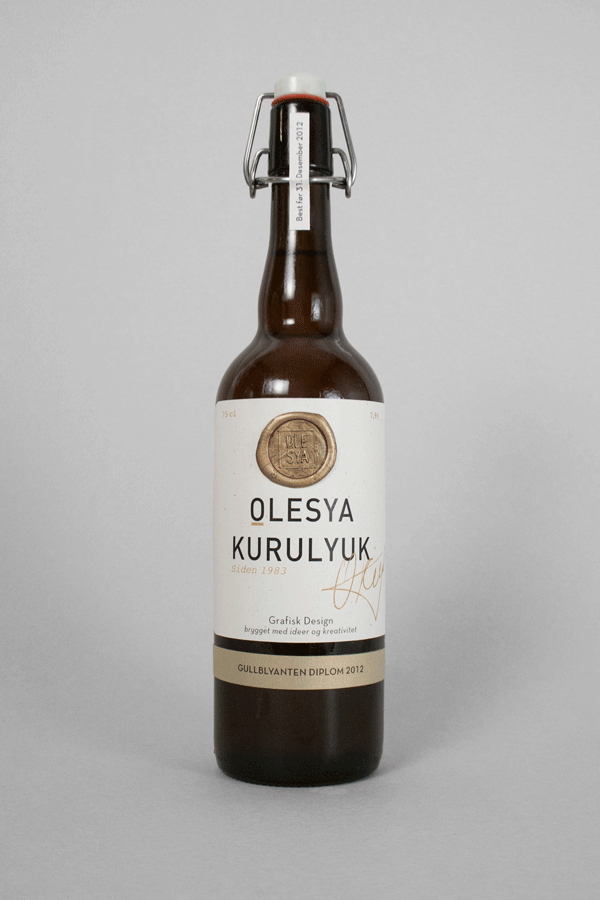
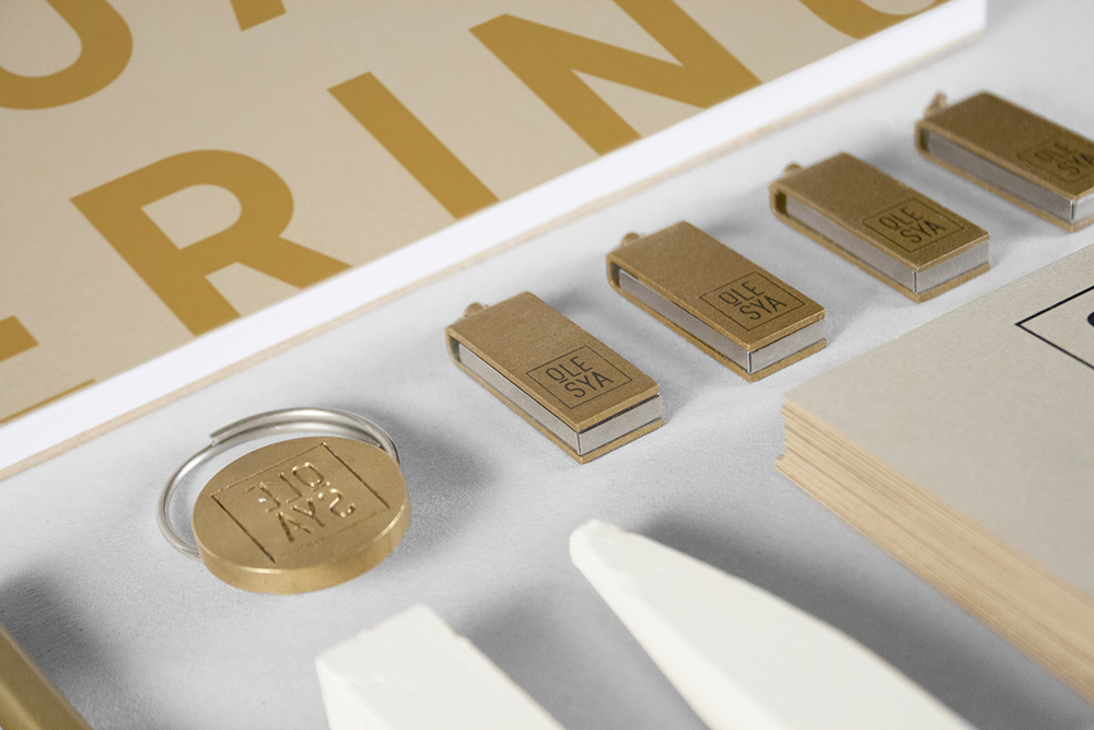
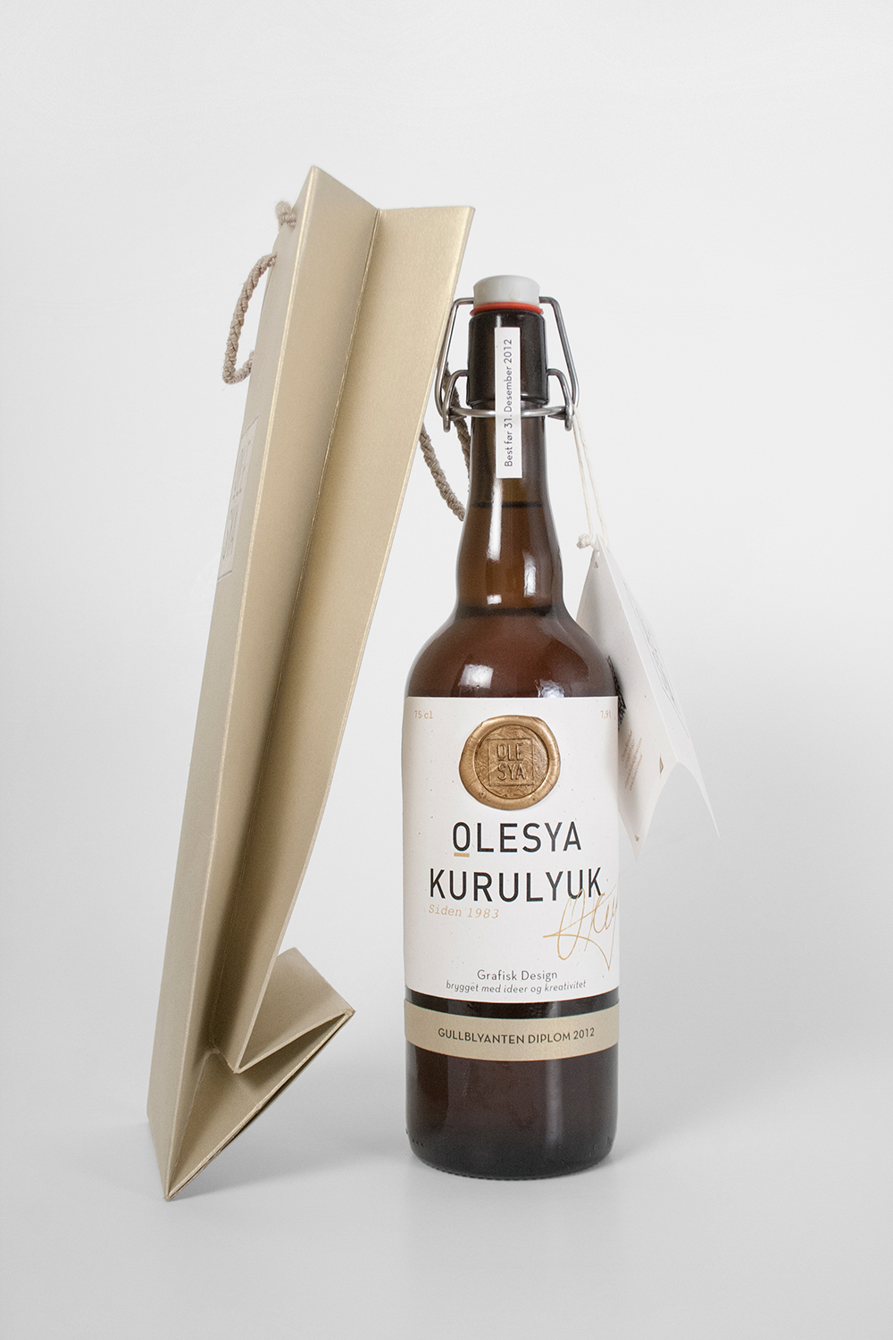
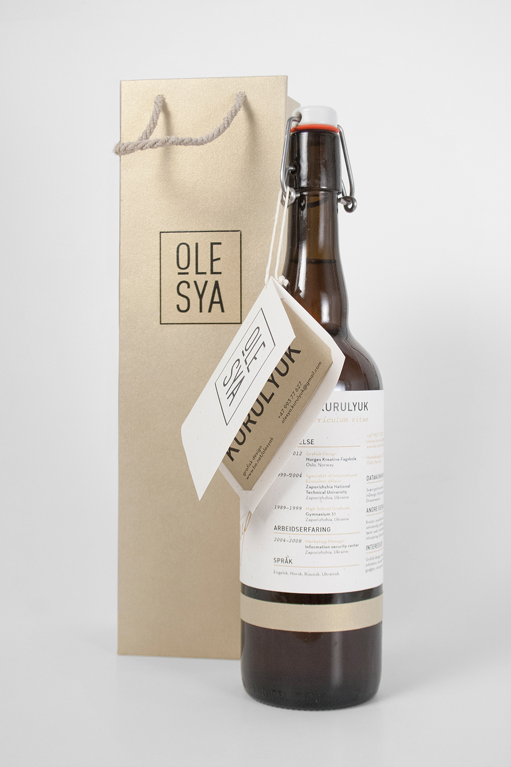
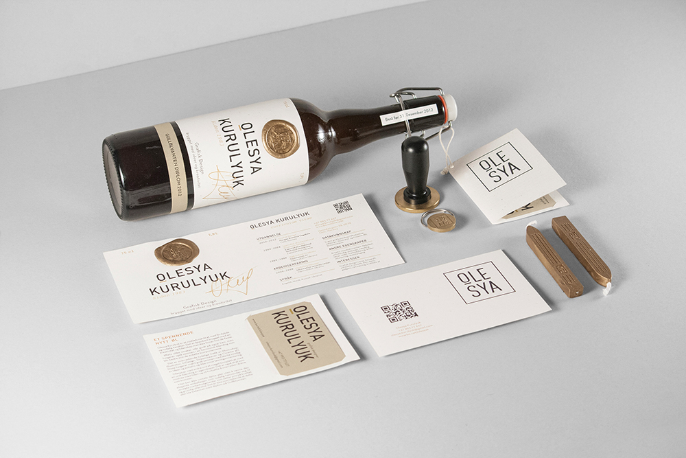
Self promotion Identity, portfolio, self promotional material
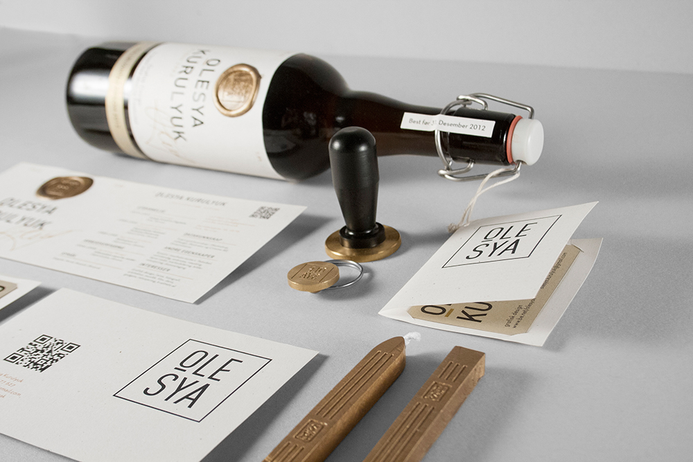
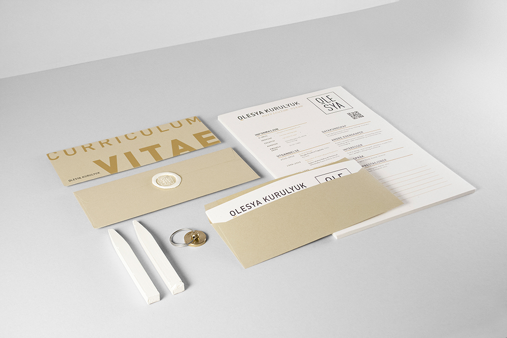
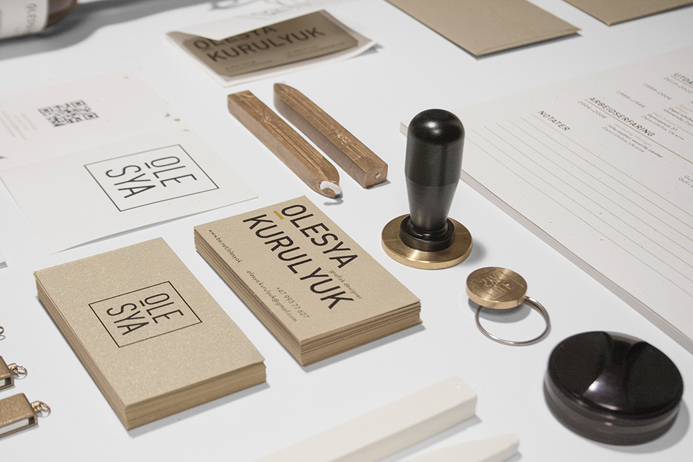
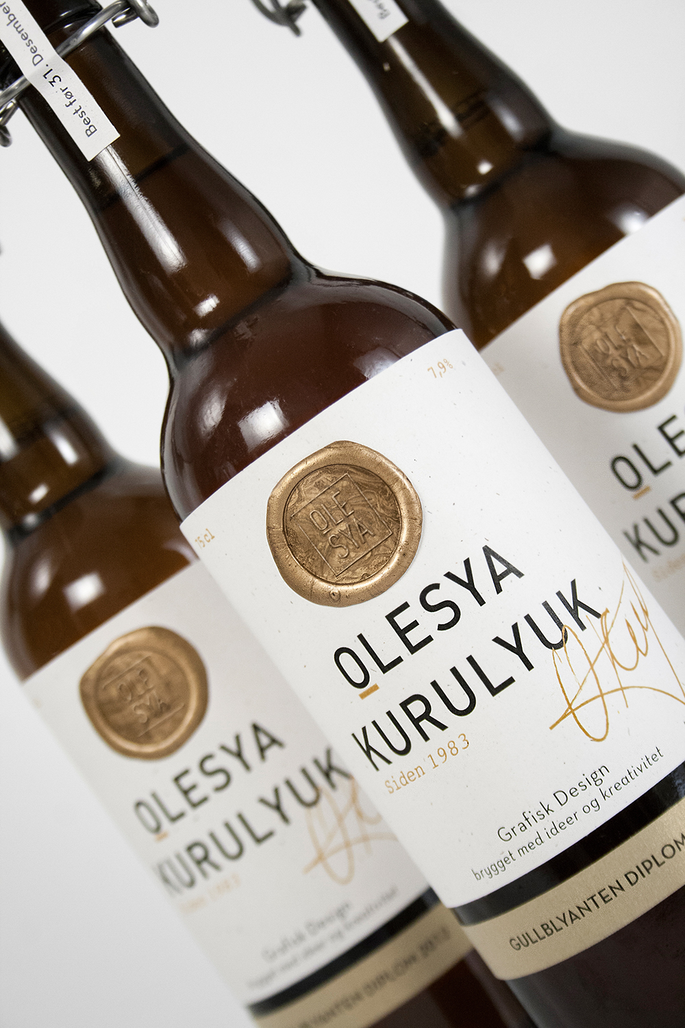
Creating an identity for myself was one of my most challenging projects. This project required me to create an identity that would tell about me as a person, me as a designer, and would solve my biggest challenge so far – my foreign background.
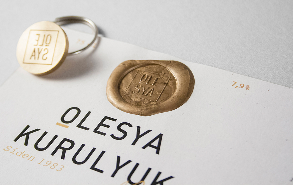
As a designer I tend to start with an idea and create my designs the way a builder builds a wall – brick by brick. As a person I aim to reach higher (step by step) and I am eager to learn something new every day. As a foreigner I have a name that is unusual and can be hard to remember. I want to show that unusual is also unique, and that being a bit different lets you see things others don’t.
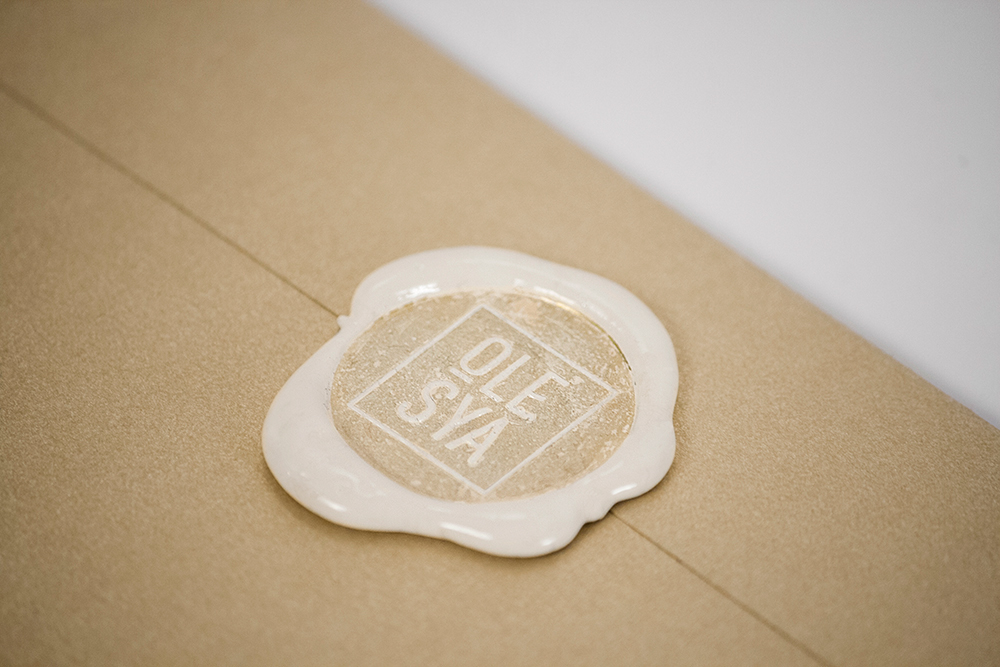
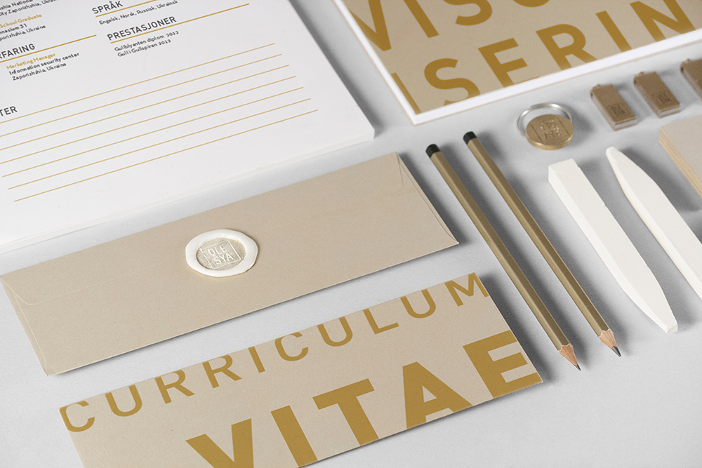
The result is a logotype focusing on my name with an element (the underline) that represents both a brick and a stair. I chose a “less is more” approach for my identity that conveys style and quality. It is meant to visually complement my portfolio designs instead of visually competing with them. I therefor carefully chose paper stock and used subtle color throughout the design.