KA&D typographic magazine
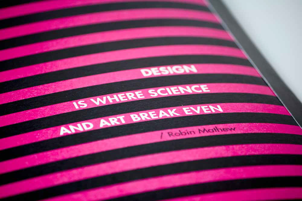
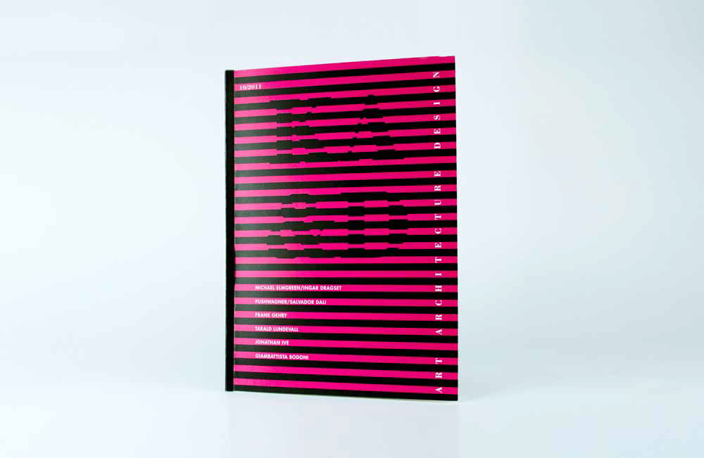
Cover: I wanted to make a cover that strikes and therefore used strong contrasting colors (black and magenta). The name of the magazine is presented as a visual effect that is easy to see from the distance but when come closer the focus drops into titles.
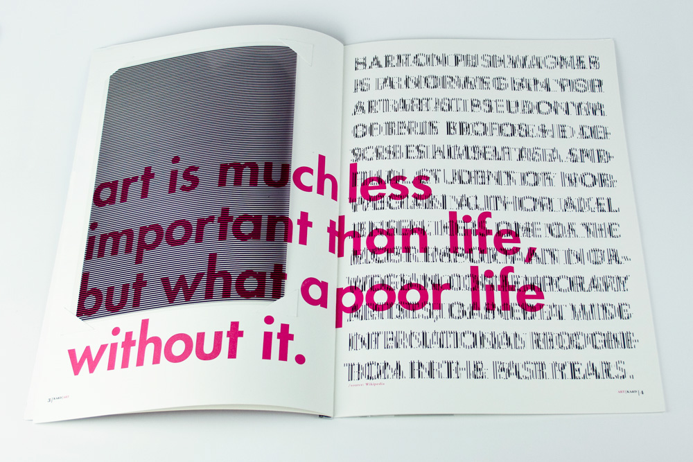
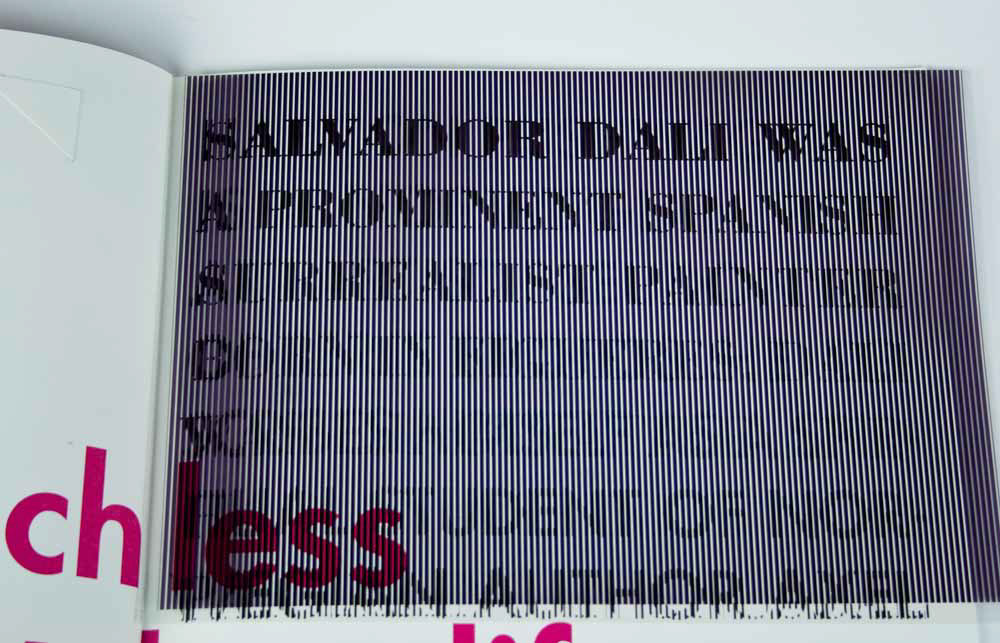
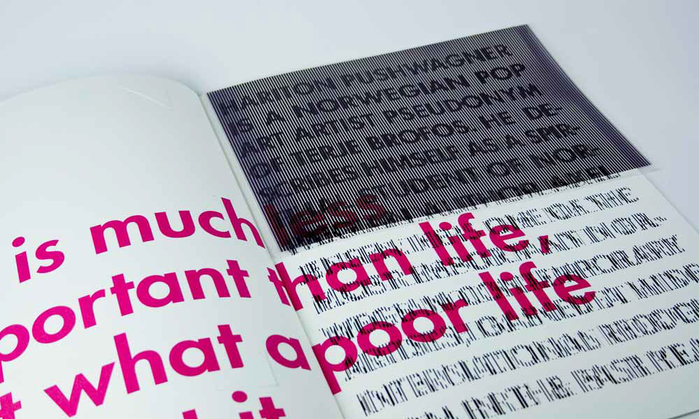
The article describes Pushwagner and Salvador Dali. They are artists from different eras. To show these differences, I chose 2typefaces: Garamond for Dali since the font represents the past and the modern Futura font for Pushwagner. Although they are different artists and have never worked together, they have much in common: both are extravagant, arrogant and"crazy". To show this similarity and difference I played with illusion using grid. Texts about 2 artists layered on each other as a symbol of similarity. In order to read each text you need to separate it by moving the grid.
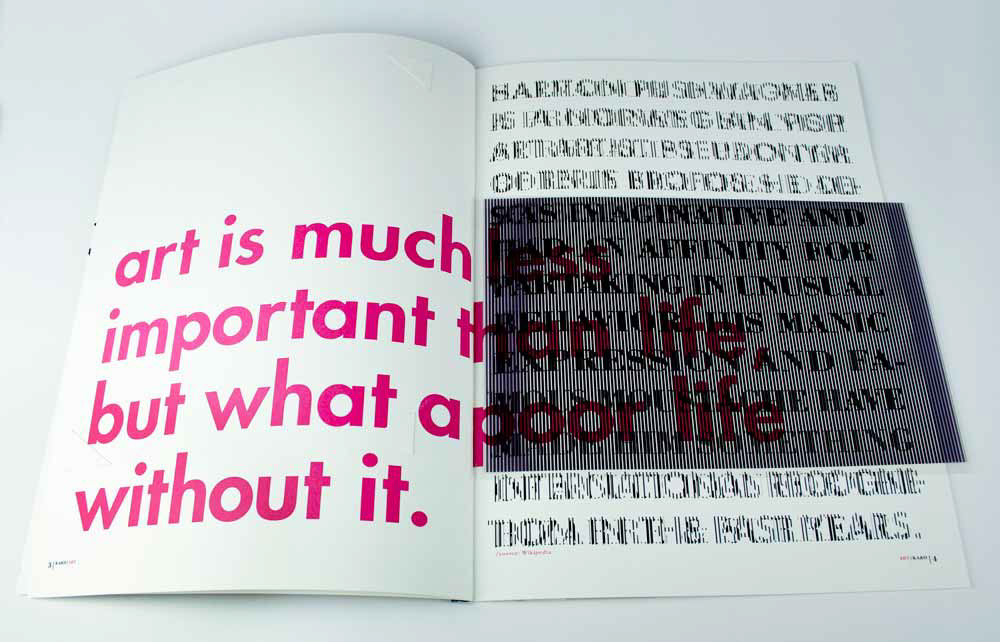
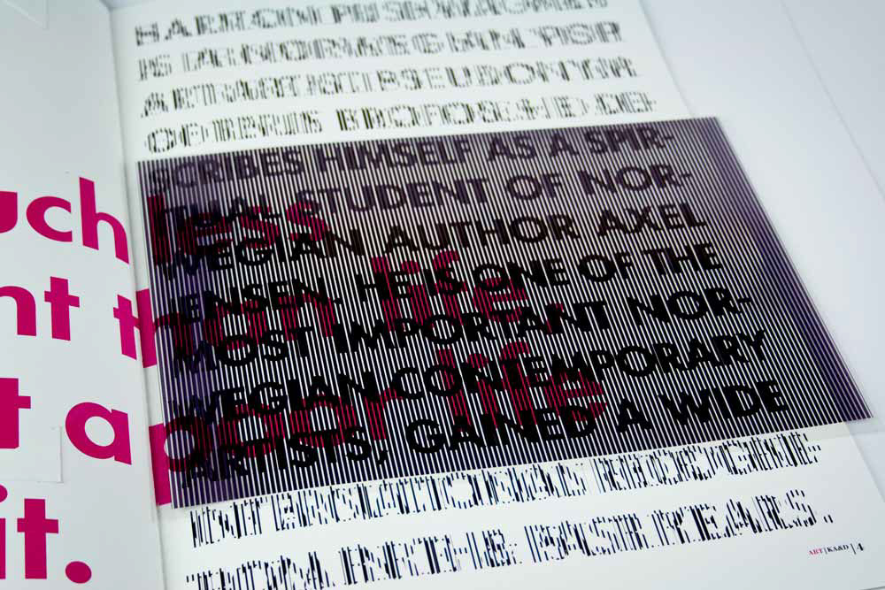
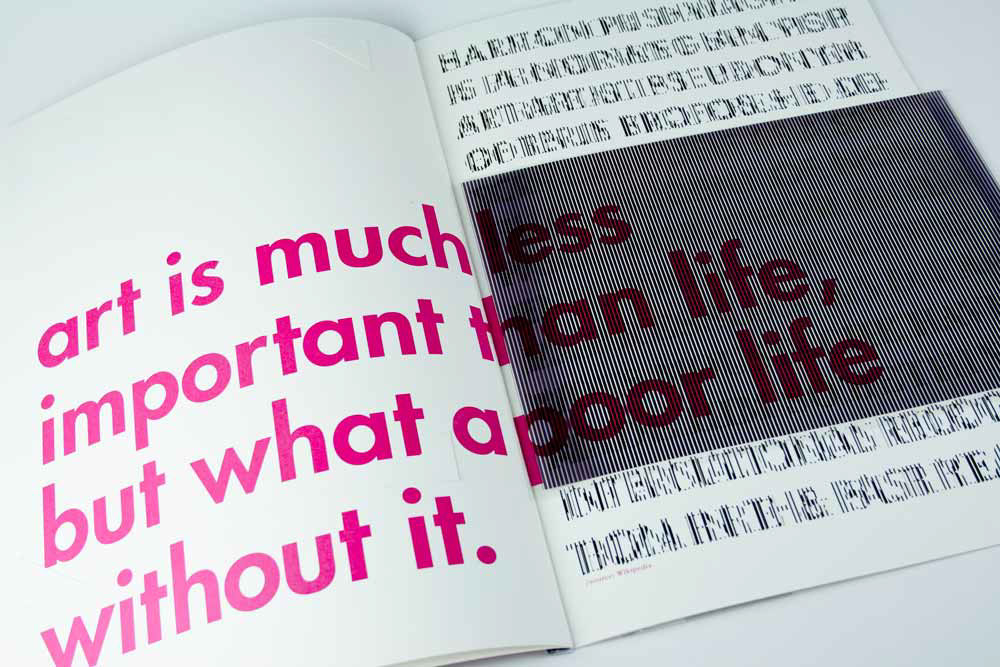
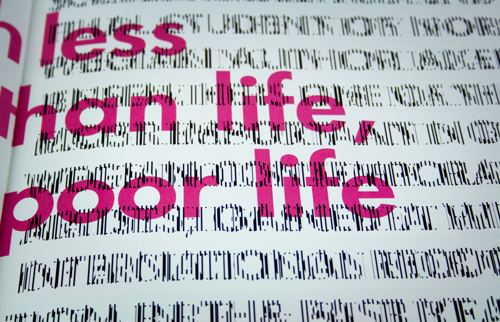
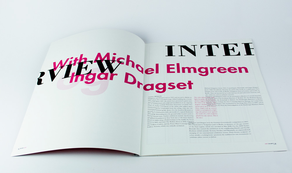
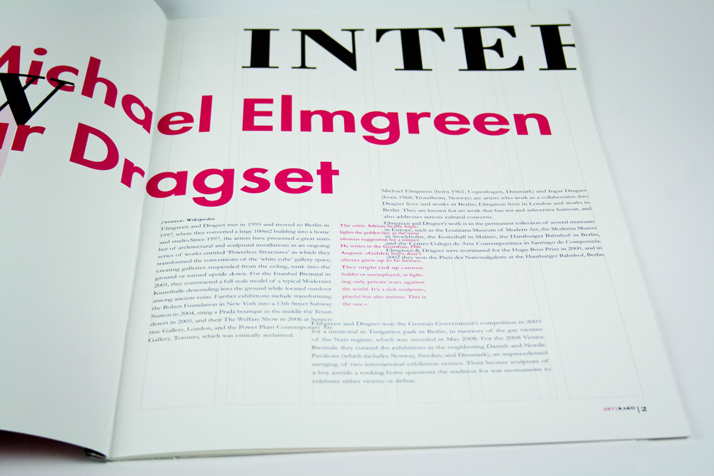
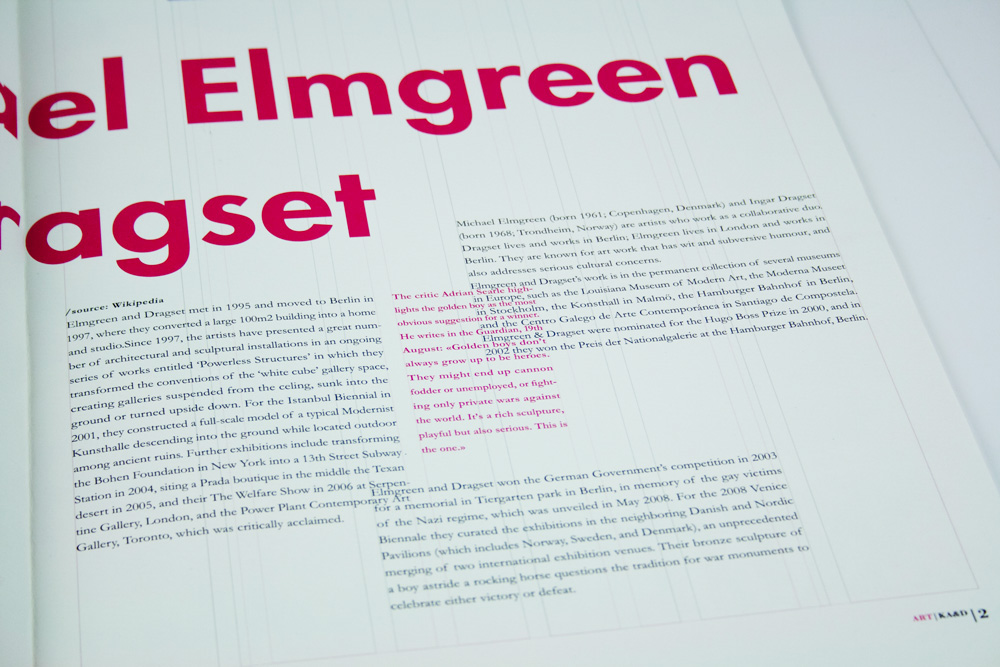
The first article is devoted to Michael Elmgren and Ingar Dragset. They are two artists who are collaborating to create installations that have become popular worldwide. As they are two different individuals I decided to separate them by using 5- and 6-columns system for the text. As a symbol of their cooperation I combined 5- and 6-column systems into one.
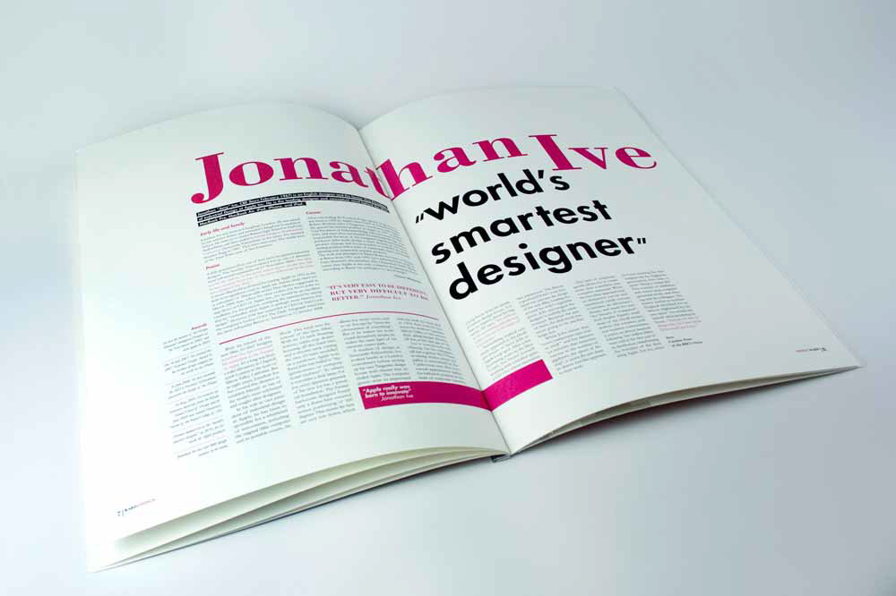
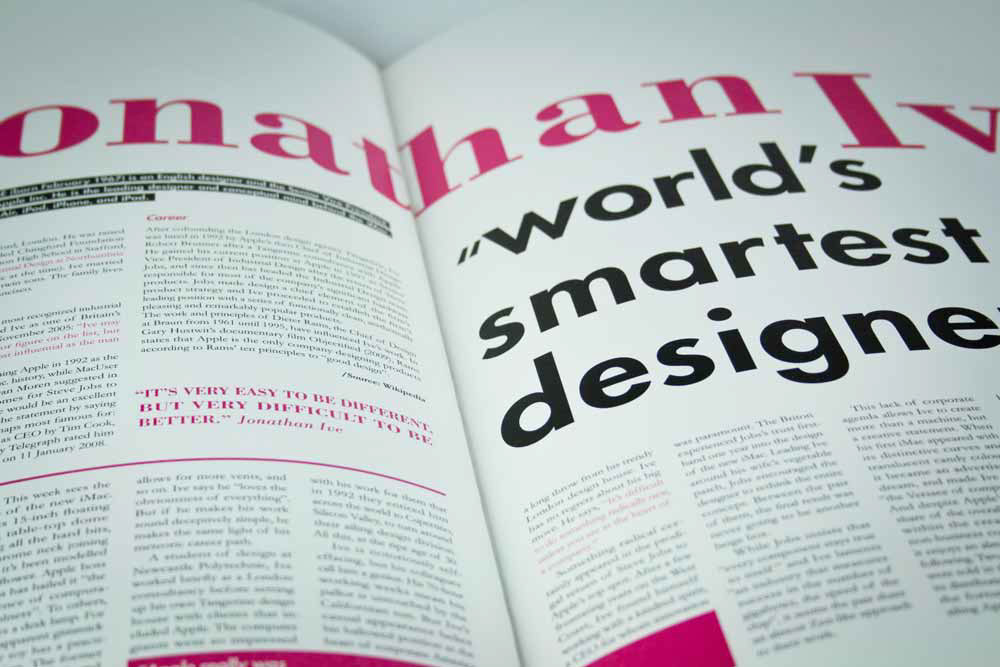
The next article is about Jonathan Ive, the world's smartest designer. He made the most popular products of Apple with a clean and simple style in common. So I thought that a “traditional” layout is best suited for the article about him.
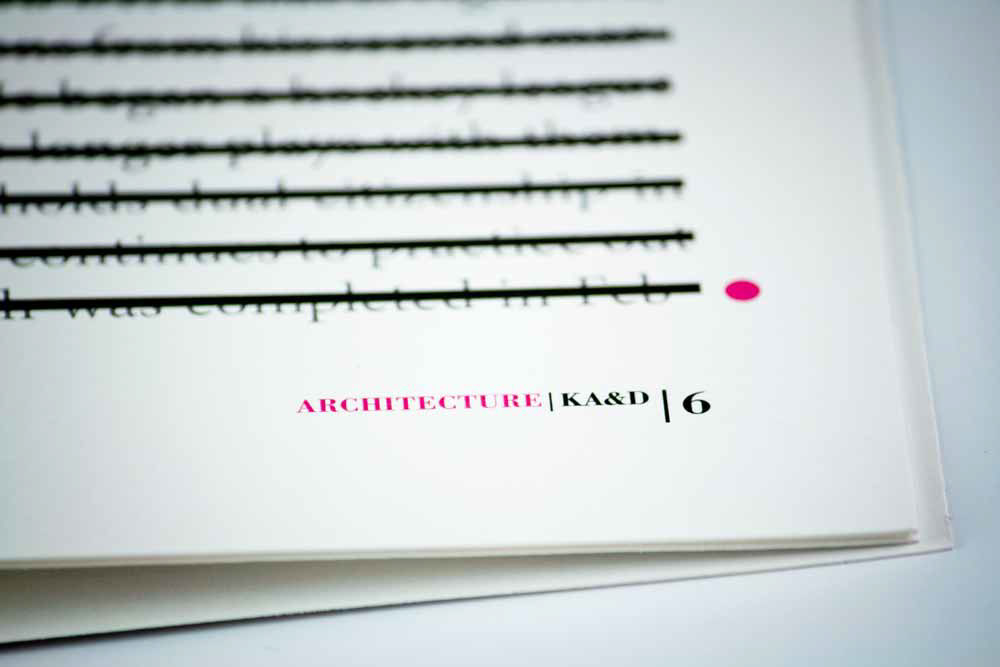
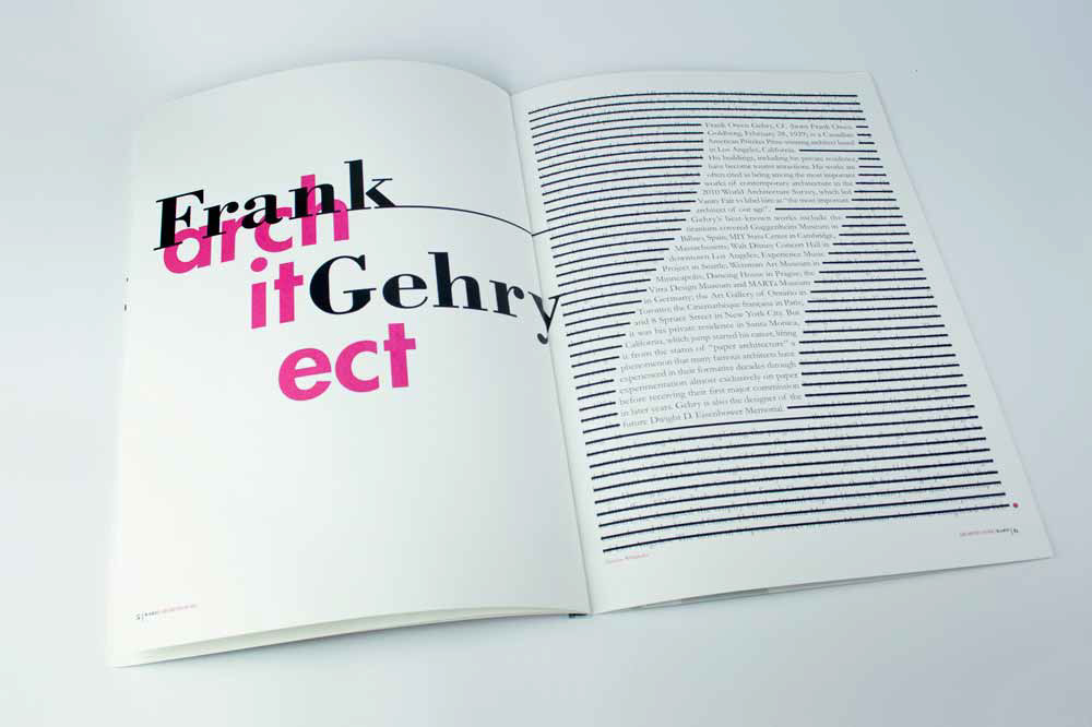
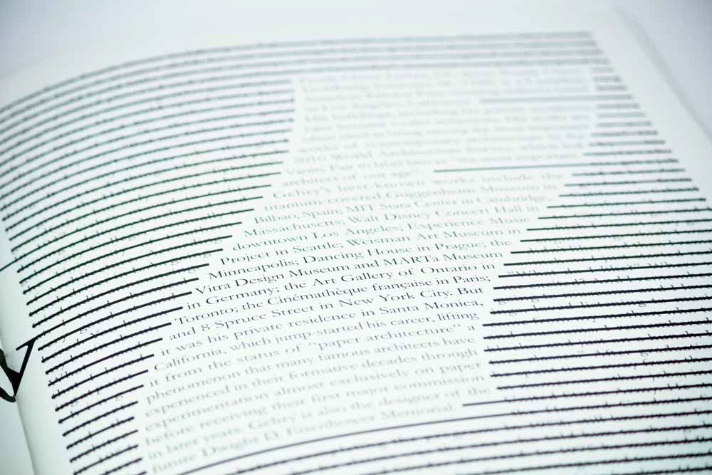
The third article is dedicated to Frank Gehry, a great architect who designed many famous buildings. We needed to use "text in the form" in one of the articles, and I thought it was best suited for an architect. So for the text I chose the shape of one of his buildings. By crossing the rest of the text I wanted to show how form is important.
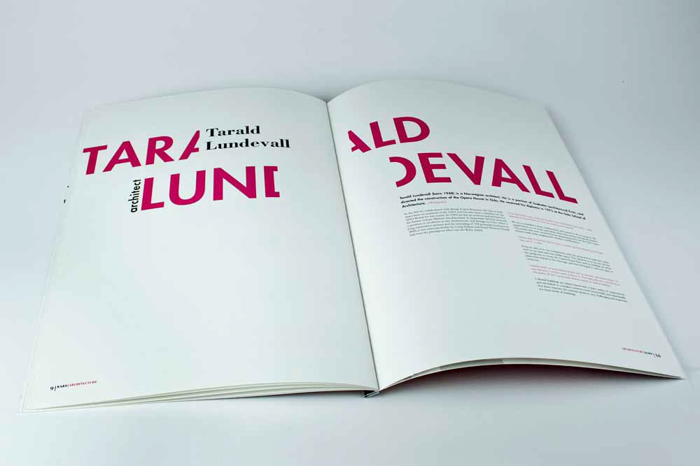
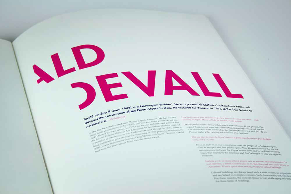
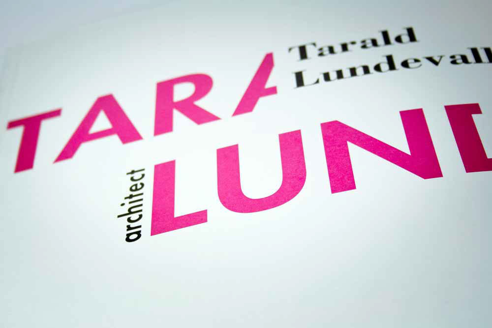
The fifth article describes Tarald Lundevall, who designed the Opera House in Oslo. Invisible lines splitting text are inspired by the “line”design of the Opera House.
